

Psyop
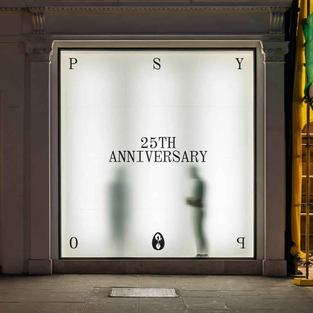
For over 25 years, Psyop has been persuading, changing, and influencing culture on behalf of brands like Nike, Google, Coinbase, Disney, and Snoop Dogg. Their work across animation, live action, VFX, and gaming has led to a global reputation, and nickname, for a certain kind of cinematic excellence — the Pixar of advertising.
But, especially for a production company of their scale, they had outgrown their brand and website system. The logo carried almost everything, without typographic language or visual architecture to hold 25 years of output together, and the identity couldn't communicate what Psyop had become. The website reflected the same gap. Organized around a roster of director names that required insider knowledge to navigate, it put hundreds of case studies — their proof of work — on the other side of a maze.
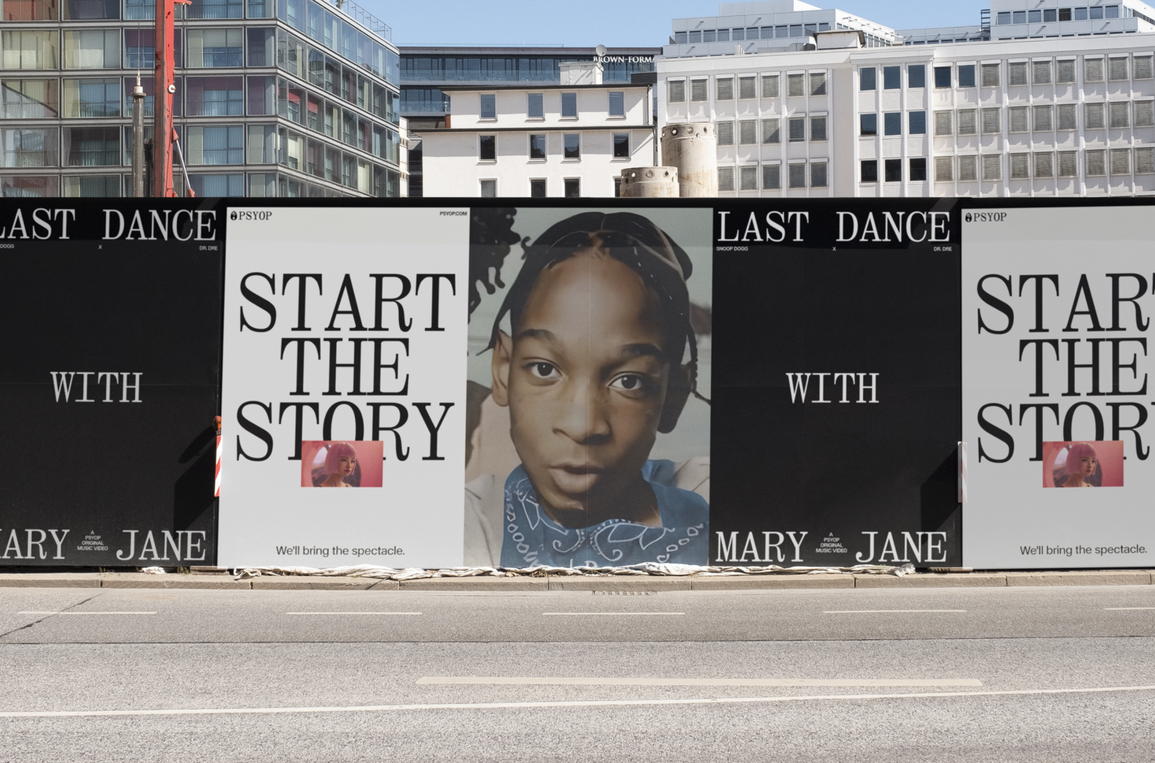
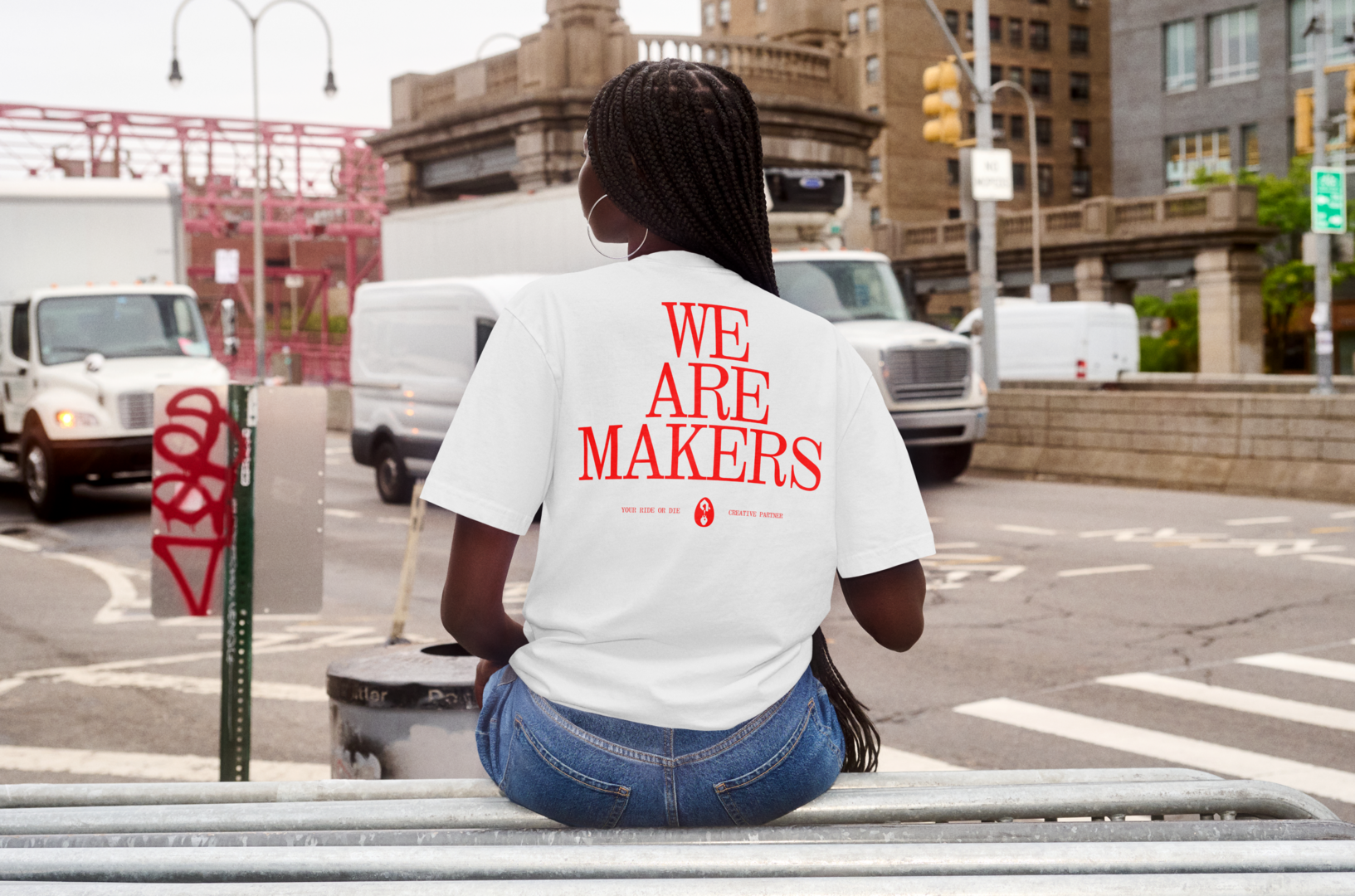
Our earliest explorations honored where they started: Lower East Side, basement-studio energy, high impact and slightly cantankerous. But Psyop wanted an identity that could age alongside them, a system reserved enough to let work this good take the stage and expressive enough to hold its own when the composition called for it.
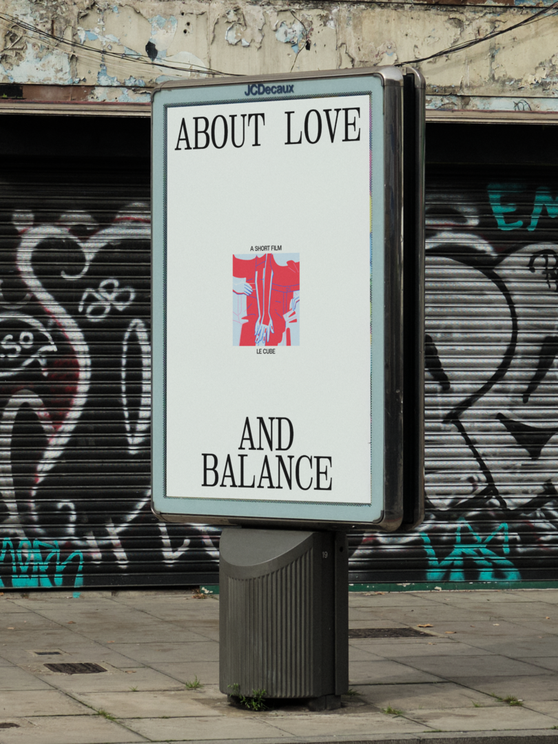
We drew on iconic film title sequences for reference, from the likes of Scorsese and Tarantino, where type is as serious as anything else on screen. This led us to New Heterodox Mono, a condensed mono slab that splits the difference between editorial and technical, its characters functioning as graphic devices when pushed and receding into the frame when the work needs the stage. In a supporting role, FT Calhern, a sans-serif drawn from the same film poster tradition, carries navigation, body copy, and the heavier lifting.
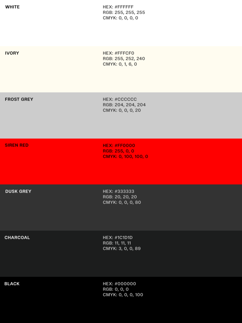
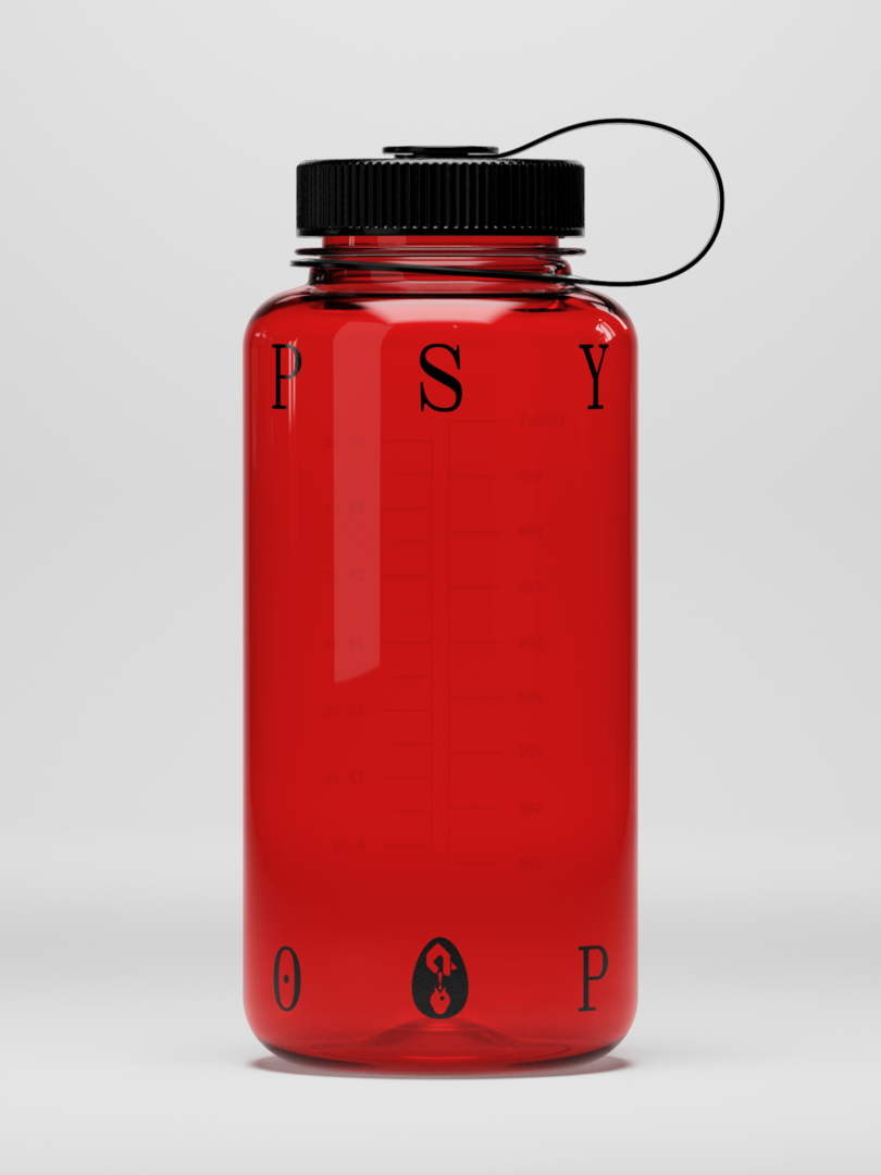
Color is kept close to black and white to serve as a frame. Light mode for communications-forward contexts and dark mode for visual ones. The only chromatic note is Siren Red, borrowed from the recording indicator on a camera. It shows up in interactive moments as a subtle signal that something is live and in-action.
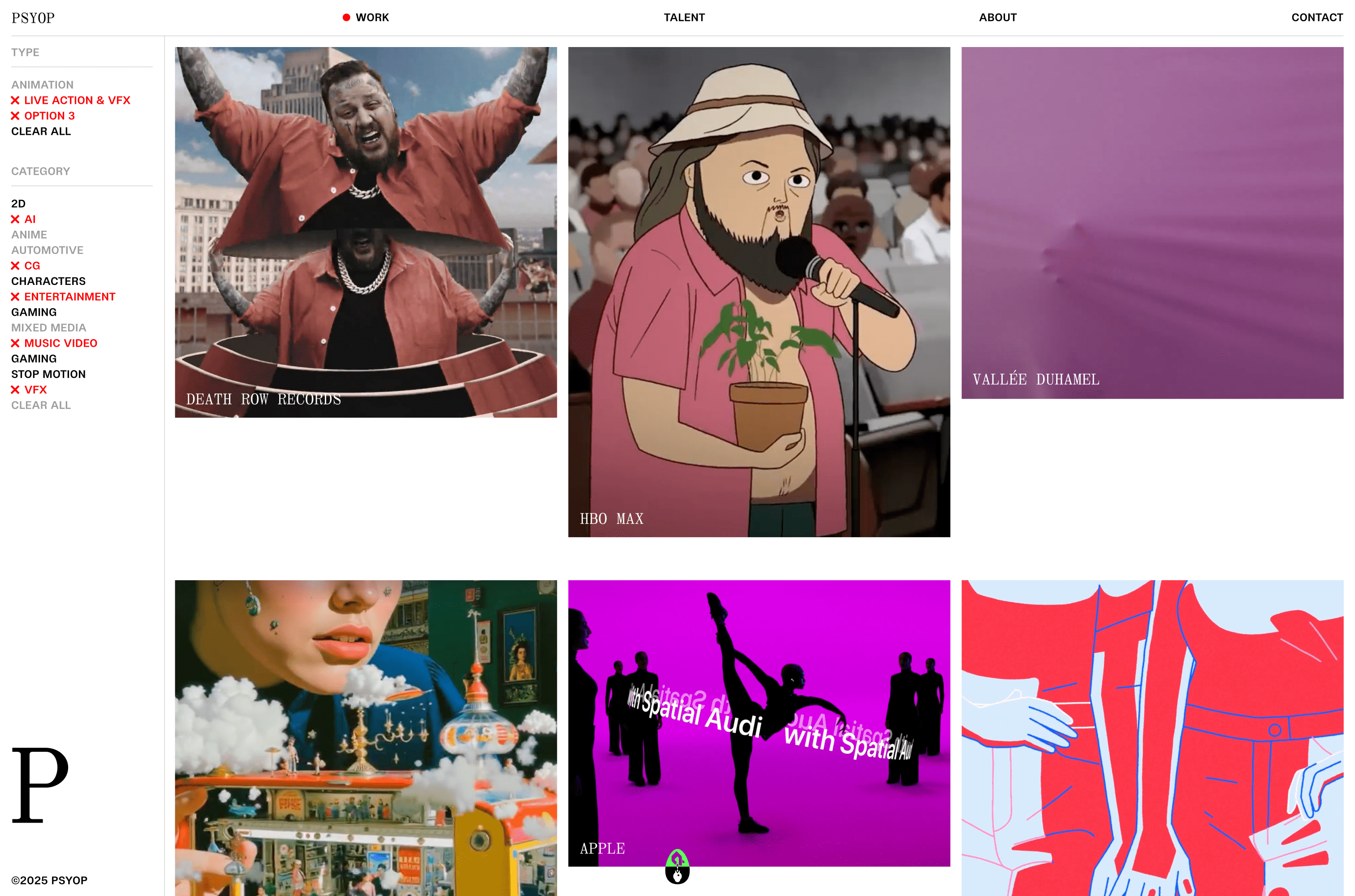
The website challenge was proportional to Psyop's scale. With hundreds of case studies, a global roster of directors and studios, and sales teams who need to move quickly in front of prospects, they needed a working digital infrastructure that could organize Psyop's immense output, serve their sales teams, and keep pace as the company grows.
The previous website worked against them. Their capabilities and a world-class portfolio were buried behind an incomplete, inconsistent list of director names with no way to search or filter by category, client, or discipline. Users were lost and the analytics showed it. After the new site launched, they heard "I didn't know you guys did that" over and over about work that had been there all along.
The new work index is fully filterable and searchable, with multi-select functionality that lets users combine categories, clients, and disciplines in any configuration. Every combination generates a unique URL, so sales teams can build a specific view of the portfolio for a particular prospect and share it as a single link. We made the site a powerful sales tool without looking like one.
Each director and studio partner has a dedicated page designed with the depth of a standalone portfolio, organized and searchable, built to communicate who they are rather than simply confirm they exist. The same system that makes the work findable makes the talent legible.
The digital design language extends into interaction. On hover, camera framing notches appear at the corners of each work tile, a quiet nod to the visual grammar of the medium. Nothing announces itself, it simply brings the work into focus.
Psyop built its name by making other brands impossible to miss. The new brand and web system finally returns the favor.
"I can't say enough good things about Studio Freight. I worked with them to refresh the Psyop branding and website and they were an absolute joy to work with — seriously the best practices and process I've seen in a studio. Call them for any digital and branding needs. They are the best." — Sandra Nam, Chief Strategy Officer
messaging
visual identity
digital design
development
Media
Services